> ## Documentation Index
> Fetch the complete documentation index at: https://cometchat-22654f5b-docs-skills-v5-temp.mintlify.site/llms.txt
> Use this file to discover all available pages before exploring further.
# Threaded Messages Header
> Display the parent message and reply count for threaded conversations with CometChatThreadHeader component in React Native UI Kit.
| Field | Value |
| -------------- | ----------------------------------------------------------------------------- |
| Component | `CometChatThreadHeader` |
| Package | `@cometchat/chat-uikit-react-native` |
| Import | `import { CometChatThreadHeader } from "@cometchat/chat-uikit-react-native";` |
| Purpose | Displays the parent message and number of replies in a thread. |
| Data props | `parentMessage` · `template` |
| Primary output | None — presentational; renders the parent message and reply count |
| Styling | `style` prop — [tokens and overrides](#styling) |
| Prerequisites | `CometChatUIKit.init()` completed and a user logged in |
## Where It Fits
`CometChatThreadHeader` is a [Component](/ui-kit/react-native/components-overview#components) that displays the parent message and number of replies in a thread.
 ***
## Minimal Render
```tsx lines theme={null}
import {
CometChatMessageList,
CometChatThreadHeader,
} from "@cometchat/chat-uikit-react-native";
import { CometChat } from "@cometchat/chat-sdk-react-native";
import { useState } from "react";
function ThreadHeaderDemo() {
const [parentMessage, setParentMessage] = useState(null);
return (
<>
{!parentMessage && (
{
setParentMessage(message);
}}
/>
)}
{parentMessage && }
);
}
```
***
## Styling
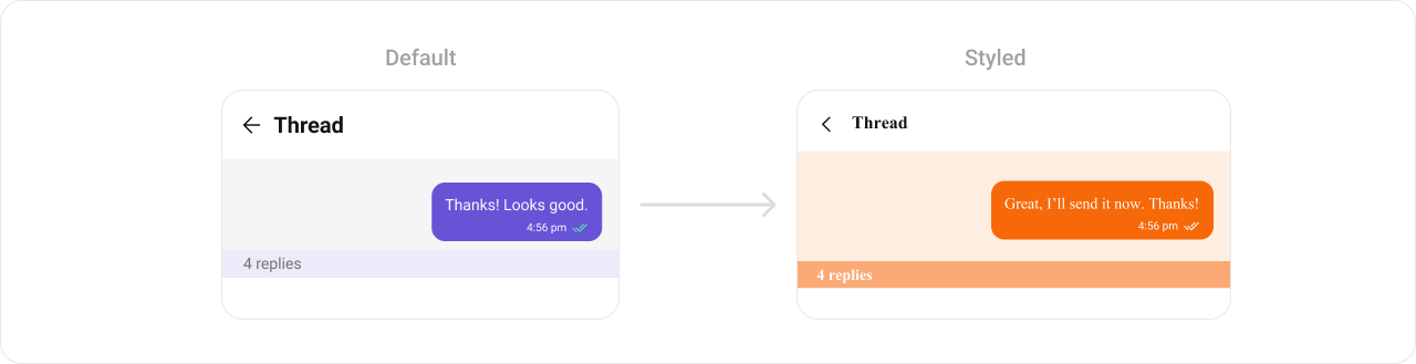
Using Style you can customize the look and feel of the component in your app. Pass a styling object as a prop to the `CometChatThreadHeader` component.
***
## Minimal Render
```tsx lines theme={null}
import {
CometChatMessageList,
CometChatThreadHeader,
} from "@cometchat/chat-uikit-react-native";
import { CometChat } from "@cometchat/chat-sdk-react-native";
import { useState } from "react";
function ThreadHeaderDemo() {
const [parentMessage, setParentMessage] = useState(null);
return (
<>
{!parentMessage && (
{
setParentMessage(message);
}}
/>
)}
{parentMessage && }
);
}
```
***
## Styling
Using Style you can customize the look and feel of the component in your app. Pass a styling object as a prop to the `CometChatThreadHeader` component.
 ```tsx lines theme={null}
import { CometChatThreadHeader } from "@cometchat/chat-uikit-react-native";
function StylingDemo() {
return (
);
}
```
### Visibility Props
| Property | Description | Code |
| ------------------------- | -------------------------------------------- | ---------------------------------------- |
| `replyCountVisibility` | Toggle reply count visibility | `replyCountVisibility?: boolean` |
| `replyCountBarVisibility` | Toggle reply count bar visibility | `replyCountBarVisibility?: boolean` |
| `receiptsVisibility` | Toggle receipts visibility | `receiptsVisibility?: boolean` |
| `avatarVisibility` | Toggle avatar visibility | `avatarVisibility?: boolean` |
| `alignment` | Alignment type for the parent message bubble | `alignment?: MessageBubbleAlignmentType` |
### Custom Template
The `template` property is used to configure and set a custom template for parent message bubble.
```tsx lines theme={null}
import { CometChat } from "@cometchat/chat-sdk-react-native";
import {
CometChatThreadHeader,
CometChatMessageTemplate,
ChatConfigurator,
MessageBubbleAlignmentType,
useTheme,
} from "@cometchat/chat-uikit-react-native";
import { Text } from "react-native";
function CustomTemplateDemo() {
const theme = useTheme();
const getTemplate = () => {
let templates: CometChatMessageTemplate[] =
ChatConfigurator.getDataSource().getAllMessageTemplates(theme);
const textTemplate = templates.find((template) => {
if (template.type == "text") {
template.ContentView = (
messageObject: CometChat.BaseMessage,
alignment: MessageBubbleAlignmentType
) => {
const textMessage = messageObject as CometChat.TextMessage;
return (
{textMessage.getText()}
);
};
return template;
}
});
return textTemplate;
};
return (
);
}
```
***
## Next Steps
Display the complete threaded conversation view
Display the list of messages in a conversation
Customize message bubble templates
Customize the appearance of UI Kit components
```tsx lines theme={null}
import { CometChatThreadHeader } from "@cometchat/chat-uikit-react-native";
function StylingDemo() {
return (
);
}
```
### Visibility Props
| Property | Description | Code |
| ------------------------- | -------------------------------------------- | ---------------------------------------- |
| `replyCountVisibility` | Toggle reply count visibility | `replyCountVisibility?: boolean` |
| `replyCountBarVisibility` | Toggle reply count bar visibility | `replyCountBarVisibility?: boolean` |
| `receiptsVisibility` | Toggle receipts visibility | `receiptsVisibility?: boolean` |
| `avatarVisibility` | Toggle avatar visibility | `avatarVisibility?: boolean` |
| `alignment` | Alignment type for the parent message bubble | `alignment?: MessageBubbleAlignmentType` |
### Custom Template
The `template` property is used to configure and set a custom template for parent message bubble.
```tsx lines theme={null}
import { CometChat } from "@cometchat/chat-sdk-react-native";
import {
CometChatThreadHeader,
CometChatMessageTemplate,
ChatConfigurator,
MessageBubbleAlignmentType,
useTheme,
} from "@cometchat/chat-uikit-react-native";
import { Text } from "react-native";
function CustomTemplateDemo() {
const theme = useTheme();
const getTemplate = () => {
let templates: CometChatMessageTemplate[] =
ChatConfigurator.getDataSource().getAllMessageTemplates(theme);
const textTemplate = templates.find((template) => {
if (template.type == "text") {
template.ContentView = (
messageObject: CometChat.BaseMessage,
alignment: MessageBubbleAlignmentType
) => {
const textMessage = messageObject as CometChat.TextMessage;
return (
{textMessage.getText()}
);
};
return template;
}
});
return textTemplate;
};
return (
);
}
```
***
## Next Steps
Display the complete threaded conversation view
Display the list of messages in a conversation
Customize message bubble templates
Customize the appearance of UI Kit components